Zintek for the Panlong Tiandi Cultural and Arts Centre in Shanghai: interview with the architect Zhu Xiaofeng

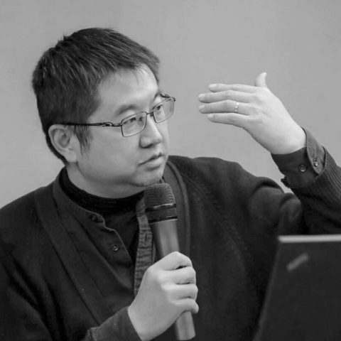
The Scenic Architecture Office, founded in Shanghai in 2004, is specialised in the use of ontological architecture as a language to answer the needs of people, of nature and of society. In every project he tries to create a balance and dynamism among these three elements through new architectural orders. Scenic Architecture’s projects have been widely published in international and local trade journals and have been sent to many international architectural exhibitions. We interview the architect Zhu Xiaofeng about the partnership between Scenic Architecture Office and Zintek.
Let’s start with an overview of this project: where is the Panlong Tiandi Cultural and Arts Center and what will it be used for?
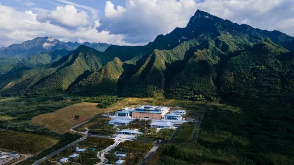
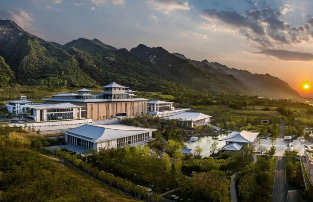
The building is in Shanghai, in the district of Panlong. Shanghai is located mainly on level ground with some small hills and many waterways. Originally, Panlong was a water town on the western bank of the Hongqiao river, famous for rice trading. During World War II, this old village was almost completely destroyed; just a few buildings and a small temple survived. This was the situation until the Shui On Group, a real estate company from Hong Kong, decided to breathe new life into this old village. The revival of this area is linked to the fact that Panlong is located in a strategic position for the mobility of Shanghai, that is, on underground line 17, just one stop from the new National Exhibition and Convention Centre and two stops from the Hongqiao railway station and the Hongqiao international airport. An area that thus becomes a new resource. However, the constructor did not want to build residential units and shopping centres but also wanted to recreate traditional elements, re-interpreting them with a modern twist. The first aim was to recover what had survived of the old town centre: the neighbourhood therefore has a central area, the old water town, where, alongside the restructured historical buildings, there are new buildings in a style that we could call “traditional modern”. Most of these buildings are used as stores, restaurants and bars. Around this central hub there will be a ring formed by parks and green spaces for recreational activities such as sports, children’s playgrounds and also spaces for vegetable plots. Finally, around this green ring there will be a residential area with luxury homes and apartments. The building we have designed will be an art museum and will be located in the area close to the park at the eastern entrance to the town. In this context, it is clear whey we are trying to develop a design that is both contemporary but with strong references to tradition, represented by the presence of rice fields. When the entire neighbourhood has been been completed, the building will be used as an art museum. At the moment, the structure and some internal spaces have been completed. But the perimeter of the water town is still being built and should be complete in one or two years. At that point, a creative team will be appointed to manage the museum and its exhibitions. The building will have an area devoted to exhibitions and another in which there will be cafeteria for visitors. It will be a multi-purpose space: on the one hand, it will house both temporary and permanent exhibitions. On the other hand, it will have an open air courtyard and farmland where rice will be grown. When visitors enter the museum from the western side of the building, they will cross over the rice fields on a raised walkway.
What was the most important element taken into consideration when designing this building?
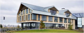
Light is always one of the most important elements in the design of museums and also in this case it was paramount. There are three levels of light in this building. The first is the space below the external corridors: before entering, visitors are already inside the project, walking across the walkways. These walkways are one of the distinctive features of Chinese gardens. To connect the outdoors to the indoors we have not only added these walkways, we have also designed a roof that, rather than projecting outwards, is open towards the outside, with large windows that encourage people to embrace the surrounding environment: the rice fields, the river, the parkland. So we re-interpret tradition with a modern twist. The second level from where the light enters are the indoor spaces: the hall and the area of the cafeteria. In these two areas there are large windows that offer views of the surroundings. The third level is inside the art gallery. In that area we needed to have walls for the exhibitions and so we opted for natural light that could be carefully controlled: we incorporated a skylight in the ceiling, in this way combining natural and artificial light. In this project, as they walk through the museum, visitors have the sensation that the light gradually fades until they enter the exhibition area where the eyes have already adjusted to the artificial light.
Why did you choose Zintek for the roof of this building and what in your opinion are the distinctive features of the Zintek titanium zinc?
This was not the first time we have used titanium zinc in our projects. In actual fact, we began using titanium zinc around 10 years ago and have used this material in many different projects; the pitched rood is an element typical of our culture and is always greatly appreciated. But this is the first time we have used Zintek titanium zinc, ten years ago there were only a few companies to choose from. While we were working on the concept of the Panlong project we couldn’t used traditional tiles because we wanted a long-lasting material and we decided that Zintek was a good choice. When assessing the other companies that make titanium zinc, I was not happy with the colours they proposed, above all the shade of grey which was always either too light or too dark, or tended too much towards blue. I, however, had a clear idea in my mind of the colour I wanted: a specific shade between blue and green which in Chinese we call Qīng. Another reason why I chose Zintek is the consistency of the material. I think that Zintek titanium zinc has has a highly precise and recognisable texture that can be noted from afar. If the colour is too light or too dark, it is difficult to appreciate its texture. Instead, with the Zintek product, even from many metres away it is possible to clearly perceive the consistency of the texture and I liked this very much. I needed this texture to remind people of the traditional building and to build a bridge between the new roof and the traditional tiles; traditional tiles have an extremely intense consistency in terms of texture. That’s why, when I saw the Zintek products I said: “This is exactly what I need, what I want.”
Was it easy to use the Zintek titanium zinc?
One of the properties of titanium zinc is that it is easy to use: Zintek’s one certainly is. First of all, it is soft, easy to treat and cut and the company’s technical support is excellent. To work this type of material not only is it necessary to have skilled workers, it is also essential to have people locally who can guide and help installers in their work, otherwise problems could arise.
What type of development do you think the Zintek titanium zinc could have on the Chinese market?
I believe that Zintek has great opportunities for growth on the Chinese market. In recent years, the private construction sector has seen a slow down. The residential buildings and shopping centres sector is experiencing a downturn. Instead, the public construction sector is continuing to grow. Structures such as schools, museums, universities, theatres are springing up in all the cities and this phenomenon will continue for a long time. I think Zintek should focus on these types of projects. Moreover, compared to 20 years ago, 10 years ago, or even just 5 years ago, the aesthetic needs of Chinese clients are growing. Clients are beginning to respect the architects’ choices, to appreciate good design that can add value to their projects. Clients are getting younger and are forcing us to broaden our horizons and test our imagination. This is very demanding but extremely inspirational at the same time. In this specific context, therefore, I think that the chromatic choices and textures that Zintek can offer will have many advantages.

